
A CollectionView in iOS (and tvOS) is a view that displays a grid of items. This is a pre-built view and is very easy to use in the iOS environment. The problem is that there is no really basic way to duplicate it for the web… or is there?
In this tutorial I am going to show you how I duplicated the display for my CollectionView in my iOS and tvOS application on the web based counterpart to the project. As it turns out it is really not that hard to do at all and only requires a little bit of basic math.
Just to show you what I accomplished, here is an animation to show you what my final results were.
The beauty of it is that it will smoothly transition between any window size. Keep in mind that this is NOT a ‘responsive’ design which is the latest trend in design, instead this is a JavaScript aided ‘fluid’ design which was the norm prior to modern mobile phones. (‘responsive’ uses CSS to change styles based on a fixed list screen widths, ‘fluid’ flows with any window size)
You can see that the cells in the display size based on the width of the window until they hit a minimum size that requires them to re-organize. Like I said, this is really a simple bit of math, so let’s get started. You can do this in HTML right on your computer to follow along.
The first thing you are going to do is to create the basic HTML page.
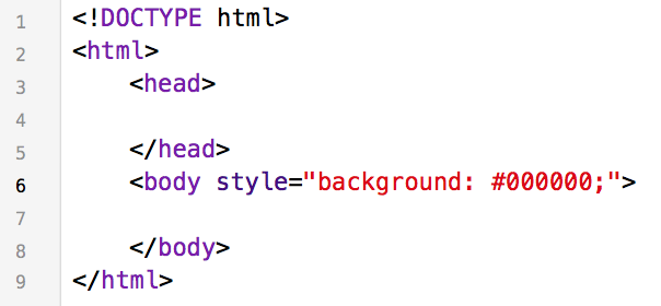
This is the basis of all HTML pages, it declares the page to be HTML at the top, creates the <html> wrapper, a <head> section and a <body> section.
If you have done any HTML before this will be familiar, if not the <body> section contains the part of a web page that you see and the <head> section will contain things that provide your browser with information for display and layout as well as scripts that control the behavior of the items in the <body>.
Once you have copied that code you can save the file as (collection.html) on your desktop and open it in your favorite web browser. Yours should result in a display that looks like this:
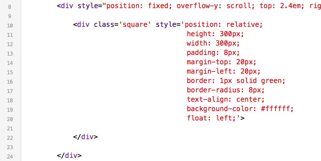
Next you are going to add a <div> element which is basically a ‘division’ or section of content on your page. We are going to add some basic styling to it as well so we can see it on the screen because the default behavior of these containers is to be invisible.
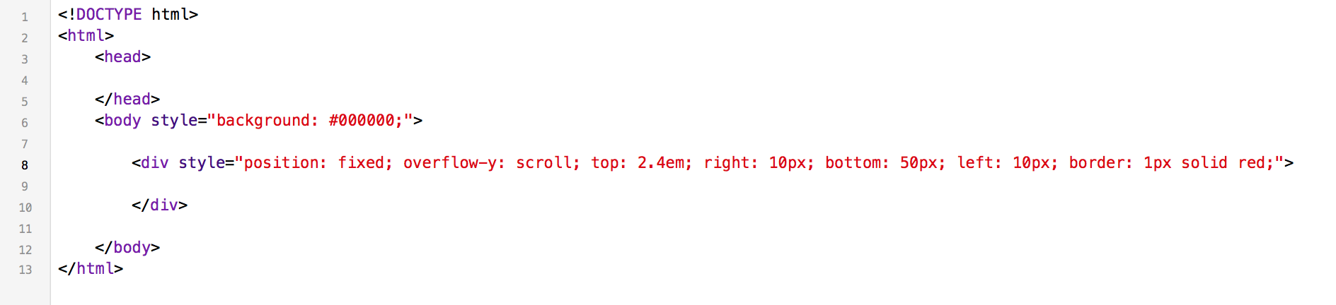
We are giving the <div> the following rules in the ‘style’ attribute:
1. fix the <div> in the window (so it doesn’t move)
2. it’s contents can scroll vertically
3. it is to be “2em” from the top of the window which is 2 times the height of the capital letter ‘M’ at the current font size
4. there are 10 pixels between it’s right side and the right side of the window
5. there are 50 pixels between it’s bottom and the bottom of the window
6. there are 10 pixels between it’s left side and the left side of the window
7. it has a 1 pixel border that is a solid line and is red in color so we can see it
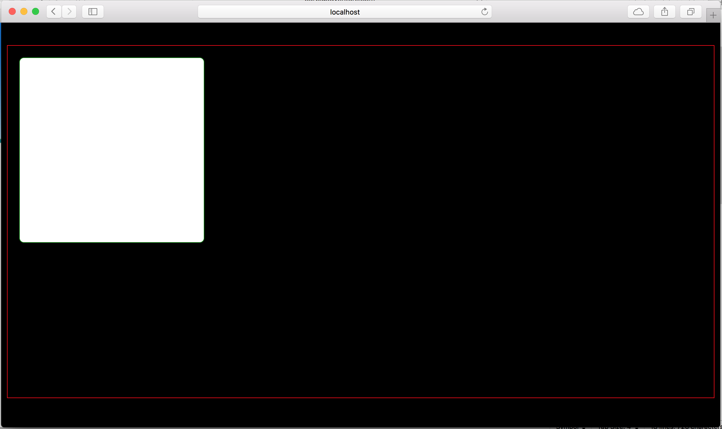
When you have completed this step, save and reload the page in your browser. It should look like this:
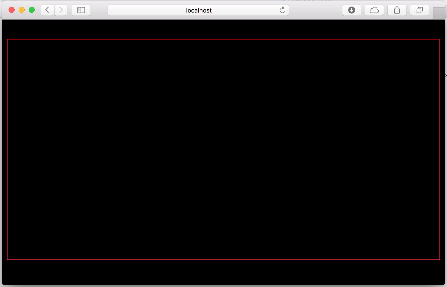
You will notice that the red box flows with the window size because we have it fixed in the window and it has fixed spacing around the outside. In iOS and tvOS these fixed elements are known as the ‘constraints’ on a view.
The next thing you are going to do is create a box which will represent the cell(s) in our collection view. Again you are going to use the <div> element to create the box and we will style it just a little to make it visible and to set some boundaries around the cell.
Update your existing <div> element to add the new <div> element inside of it like this:
This new element is being assigned a ‘class’ which we are calling ‘square’. A class lets you assign styles to an entire group of elements and in a completed web project your style attributes would be in a separate file and belong to this class. For this tutorial I am showing the style elements as attributes to the elements that they belong to so you don’t have to deal with multiple files and it is clear which element the styles impact.
The styles we have added to our new <div> element are:
1. the position is relative, meaning it is relative to it’s parent. This is the default so we could just have easily left this style out entirely.
2. height and width are set to 300 pixels to define our square.
3. the padding is the space that we want as a buffer within the boundary of our element. here we set it to 8 pixels which will keep any text or other things from appearing within 8 pixels of the boundary of the cell.
4. the margin is the space that we require on the outside of our element. We set this to 20 pixels on the top and left so that there will always be 20 pixels of nothing above and to the left of our cell.
5. the border is set to a 1 pixel solid green line so we can see it on the screen
6. the border is given a radius of 8 pixels which will round off our corners
7. text is aligned to the center of the cell
8. the background color is set to #ffffff which is the hexidecimal representation of ‘white’
9. we are going to float this cell to the left
Float is a fun property to experiment with, it pushes the element to the left or right of the available space unless there is no room for it. If there is no room for the element, then it will be pushed down to the next available area that it fits and can float right or left based on what you specified.
You can save and refresh your page in your browser again to see the results. You should see a single box inside of your red <div> element and it should be at the top left of the red box with 20 pixels separating the box from the top and left of the red lines.
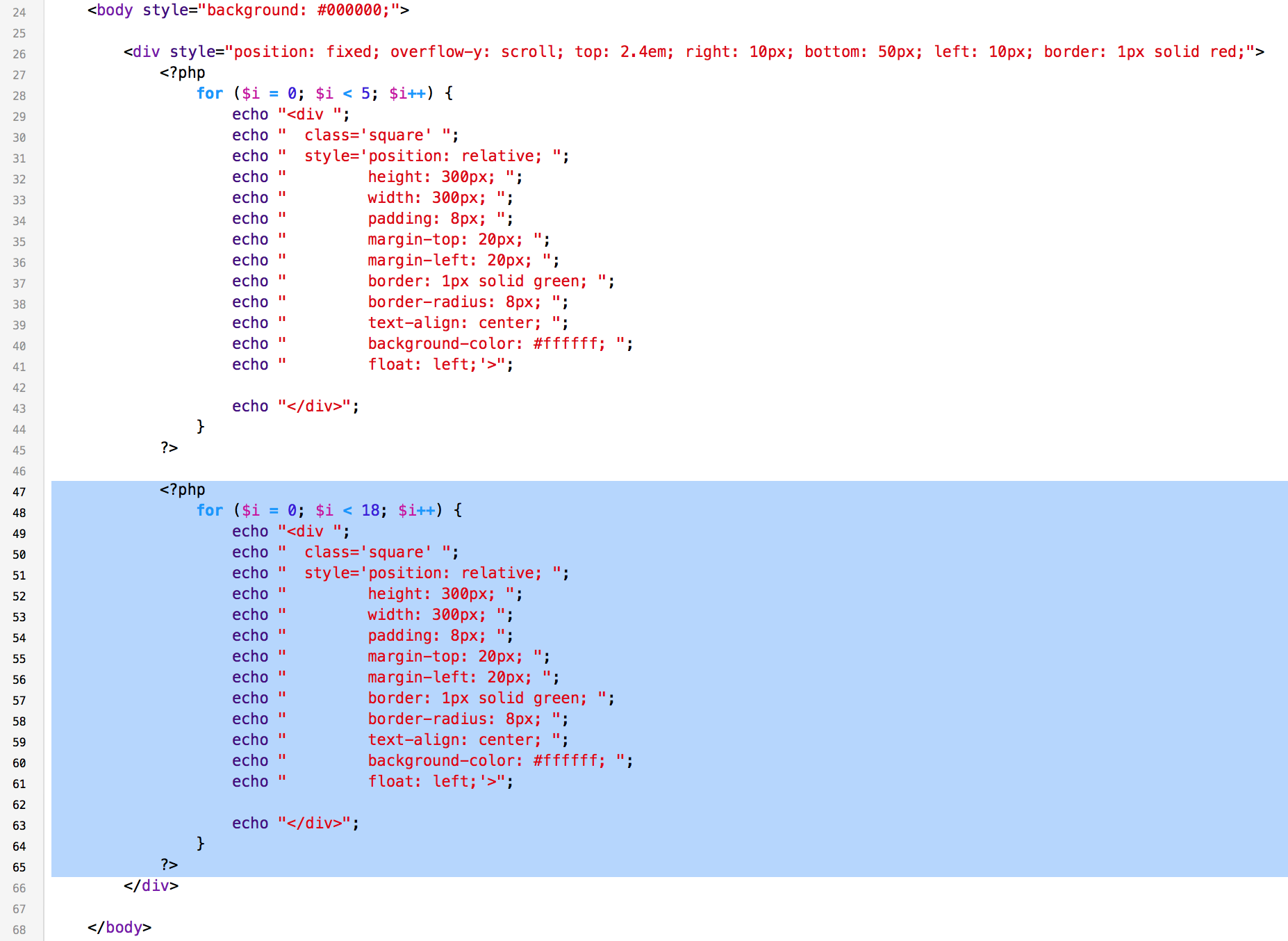
This is the part where we run into options, if you are following along with a text editor and your web browser copy and paste the new <div> element (our cell) one after another so you have a bunch of cells.
As a shortcut and to keep the line numbering low I am going to add a simple PHP loop to my cell so it repeats 50 times. (you can pick a smaller number, 8-12 should be sufficient.)
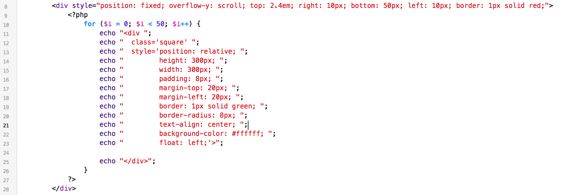
Now you can refresh your browser again and you should see an entire grid of cells all spaced by 20 pixels!
This is great except it doesn’t fill the screen and the transition between adding and removing a new column is not smooth. This is where we can do a little math to help the browser with this display.
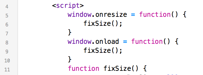
You are now going to write a little bit of Javascript, it is not complicated and I will explain what you’ve done once you have updated the <head> section of your page to match this next block of code:
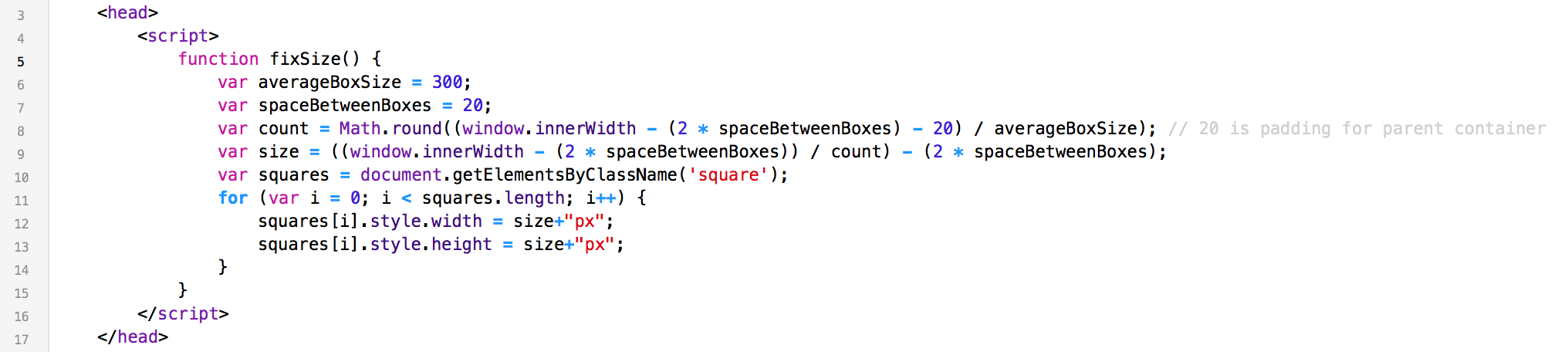
When I write my scripts I like to use very long variable names so I can describe what they represent. This makes it easier to come back months or even years later and quickly understand what is going on. Let me explain what this script does line by line.
line 5 – we declare the function and name it ‘fixSize’ because that’s what it is going to do, fix the size of our cells.
line 6 – we are creating a variable called averageBoxSize to set the average size of our cells to 300 pixels.
line 7 – we are creating a variable called spaceBetweenBoxes to define the distance between the boxes for our upcoming calculations.
line 8 – we are creating a varible called count that will be the number of boxes that can fit within the existing window and rounding it to the nearest whole number. The number of boxes that can fit is easy to calculate, it is the available width of the window minus 2x the space between the cells minus 20. (the 20 is the sum of the 10 pixels on the left of our red box and the 10 pixels on the right of the red box.)
line 9 – we are creating a variable called size that will be the size of the cell that will perfectly fit this window width. The size is the window width – 2x the space between the cells all divided by the count that we determined is correct for this window size. Then we subtract 2x the space between the boxes to account for the space that we need on the right of the last cell of each row and the space outside of our red box.
line 10 – we are creating a variable named squares and adding all of our elements with the class name ‘square’ to it
line 11-14 – here we are looping through all of our ‘squares’ and setting their ‘width’ and ‘height’ values to the ‘size’ that we calculated above.
That’s it, the math portion of this project is done! But we are not calling this function anywhere so let’s add just a few more lines of Javascript above this function to fix the size of our cells when the window loads and when it changes size.
So just above the last function add the following code:
And now you are ready to see the results of the script! Refresh your browser and you should see something like this:
Ok, so for all basic purposes you are done and you have a nice fluid grid display that you can go play with. But if you would like to stick around for more I can show you how to add a separator between segments and also how to make images within your cells flow as well.
Next we need to separate our cells into two groups, if you copy/pasted a bunch of cells in your code just pick a spot between two of them, if you copied me and uses PHP as a shortcut, just copy your loop and change the number of cells in the loop for both. In my example I am going with 5 for the first section and 18 for the second section.
To separate the groups add another <div> element between your sections and set it’s styles like this:
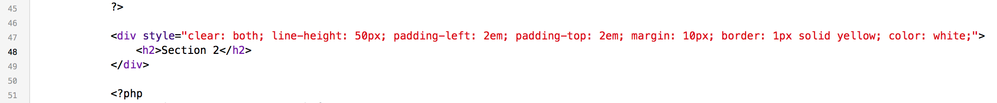
The styles we set for this element are:
1. clear: both; this puts the element on a fresh line where it can have 100% clearance on both sides to the edges of it’s own container.
2. we set the line height to 50 pixels to make it obvious that this separates the cells in the two sections
3. we pad the element on both sides by 2 M’s
4. we add an outside margin of 10 pixels on all sides
5. we give it a yellow border so we can see it
6. we set the color to white (not the background color, this is the color of text in this element)
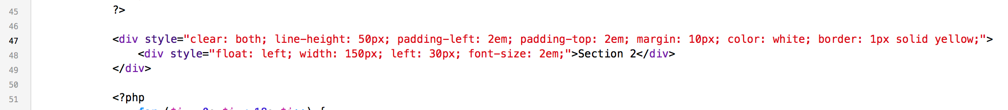
We also added a level 2 header tag to the element and wrote ‘Section 2’ in it as our label. In iOS this would be a section header, and for us it serves the same purpose here.
Save your changes and refresh your browser to see the results.
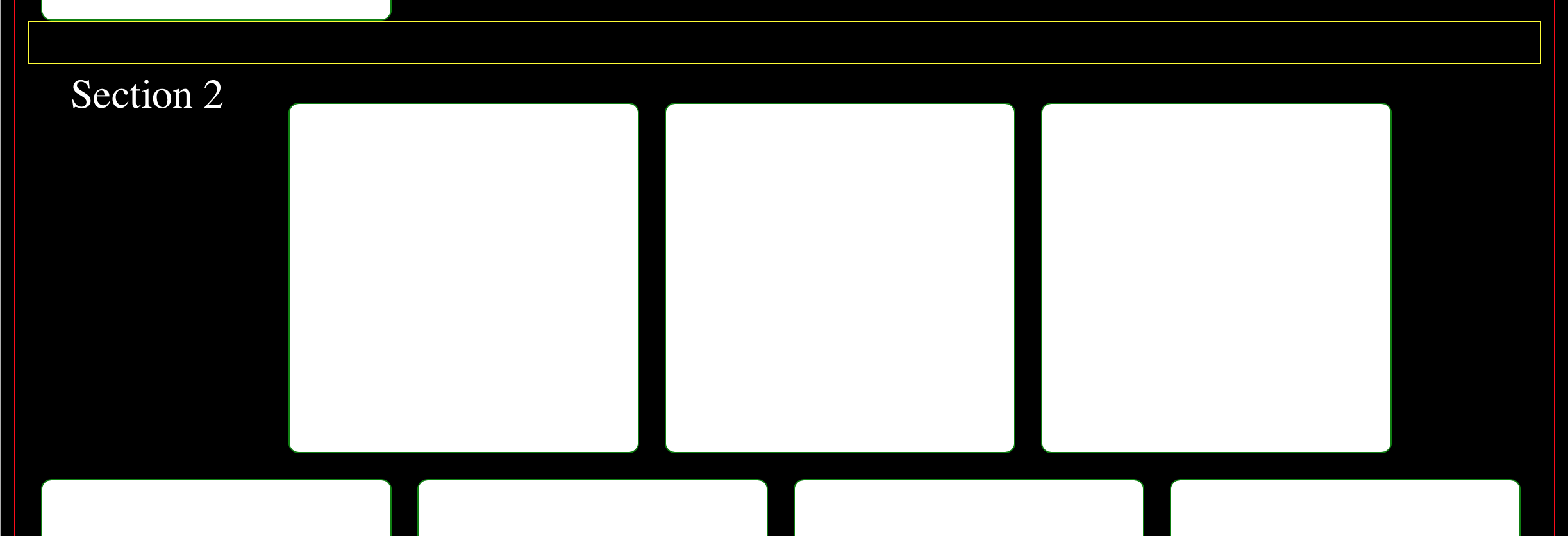
You will see that we have a problem with this layout. It appears that the behavior of the <h2> element is not working well with the <div> element that we set aside for our section header. Typically all header elements start their own line and it can sometimes cause layout issues like this. Don’t worry, it’s a simple fix, you are going to swap the <h2> tags with <div> tags and add some styling to it to, then you are just going to add another
First replace your <h2> element with this:
Then add this <div> element to your code below the section header <div> that we are working with:

Now when you save and refresh your browser your display should look like this:
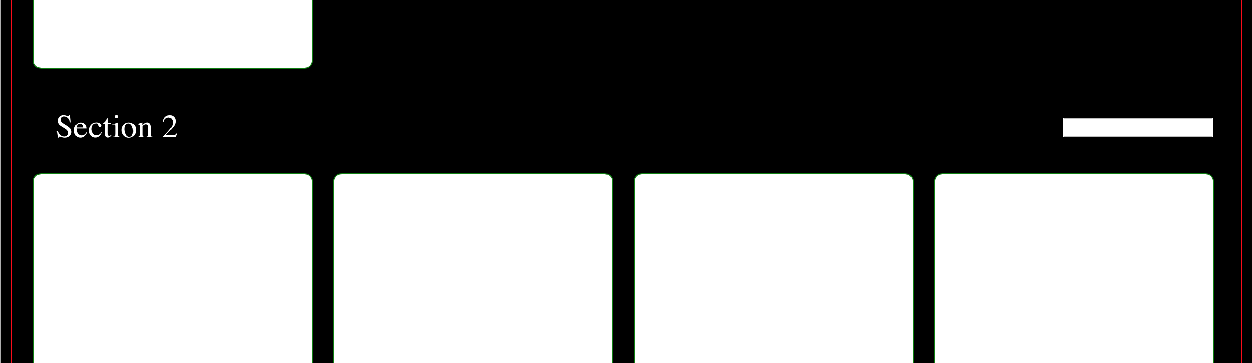
Next you are going to add a text field to your section header and make it float to the right hand side. We can also remove the yellow border on our section header because we are starting to get a very busy display. Remove the border from the section header element and add the following code to your new <div> element under the <h2> label:
What you have added is a new <div> element that floats to the right, has a 10 pixel margin on it’s right side and 10 pixels of padding on it’s inside. Inside of the new <div> we added an <input> of type ‘text’. (We are not going to make this do anything in this tutorial, this is only for display purposes. I will show you how to make these things work in another tutorial.)
Save your changes and refresh your display. Your display should look like this:
So far so good right! But it would be really nice if our text box was the same width as our cells and because you have done so much awesome work to make your cells change size based on the window you only have to add one line of code to now update this text box along with your cells. So go back to your javascript and add this line just above the ‘for’ loop:
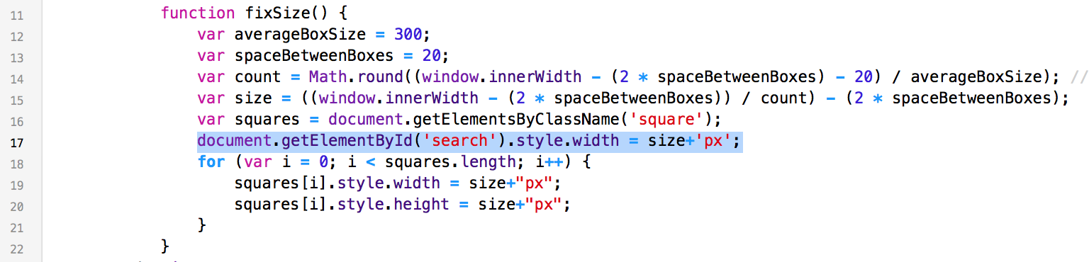
No save and refresh to see your text box size along with your cells!
Now that is a nice display, Good job! Feel free to go back and play with the syles of the elements to make them as prettier if you would like, just keep in mind that adjusting the margins of the cells may require you to also update the javascript to keep the display flowing nicely.
So the last thing we are going to do is add some images to our cells, this is going to make our display look much more complete. Go ahead and add an image tag to your cell:
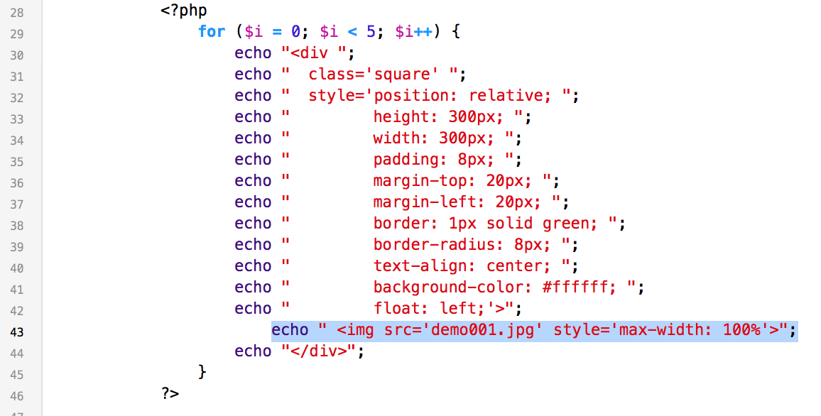
If you just copied your cell code and pasted it through your project your change will look like this for each cell:
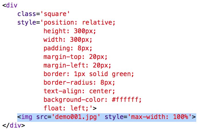
In our image element we set the source of the image to the name of our image file (assuming that it’s in the same folder as your code file) and we set the maximum width to be 100%. The 100% refers to the container that the image is in which is our cell and the reason that the image doesn’t go all to the edges of the cell is because we told the sell to pad it’s insides with 8 pixels.
Save and refresh your display again and you should have a nice display like this:
The cells that we designed are square which leaves us some room for labels or whatever else we need below the images, but if you don’t need that you can adjust the size ratio of the cells in the ‘for’ loop of the javascript as needed.
Thank you for taking the time to follow along with this tutorial, I hope you learned some new tricks and maybe even jump started a project of your own! If you liked this tutorial please let me know and if there are any topics that you would like me to cover in iOS or PHP development please let me know!